An ecommerce homepage has a variety of tasks to perform for users, from helping people to find and buy products, to signposting other key information such as help from customer service.
In this guide, we’ll look at the different elements and features that retailers should consider including on their homepages, in order of importance.

The guide is a detailed exploration of the 48 elements included in this tweet thread, from @danbarker, and by reading this article – in just a few minutes – you’ll have an excellent picture of how common Ecommerce homepages function (and, perhaps, how you may improve your own).
dan barker@danbarkerReplying to @danbarker
Some of the features referenced here may be essential for any retailer selling online, while others are extras that are useful to have, or more applicable to certain types of ecommerce sites.
The challenge for retailers is to make sure that visitors can find the things they’re looking for while keeping the page easy to use and navigate.
One way to do this is by following an ‘inverted pyramid’ design, in which features are ordered according to their importance to the retailer and visitor.
In this way, new and casual visitors see key USPs and the products retailers want to push, while more committed shoppers can find the more niche features and content they’re looking for.
Key ecommerce homepage elements
These are the elements and features that most frequently appear on ecommerce homepages, listed in the the order in which they tend to appear, from the top to the bottom of the page.
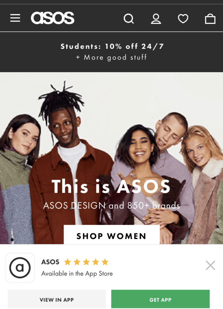
1. Top navigation bar
This contains the key links to different departments and / or product categories as well as other key elements like site search, log in and shopping cart.

2. Visible search icon
This allows shoppers who prefer to search directly for items to easily access site search. Somesites will show a search bar, like M&S above, while others use an icon.

As some studies have shown, site search users may be more likely to convert, and arriving at a site with a specific product in mind can indicate a greater intent to purchase.
3. Shopping cart link
The shopping cart link should be visible, while it’s also useful to highlight the fact that items have already been added to the cart. This is also good spot to place links to visitors’ wishlists.
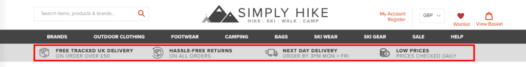
4. Offer bar
The offer bar is a place where retailers can highlight key information, often around delivery and returns, or perhaps current promotions.
It helps to ensure that visitors are aware key points that may affect their decision to purchase. For example, if shoppers know that delivery is free, then they don’t need to look for this information later on.
5. USP bar
Unlike the offer bar, the USP bar is about telling people about the brand’s unique proposition. For example, a retailer might highlight that its products are ethical or organic.

6. Main category entries
This is where sites will show the most popular categories, those that visitors are most likely to click on and buy from.
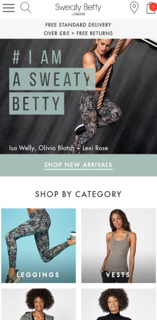
7. Seasonal categories
These categories are appropriate for the time of year, or events taking place at the time, and so are adjusted from time to time.
Here, for example, Sweaty Betty shows jumpers and base layers when the weather is colder.
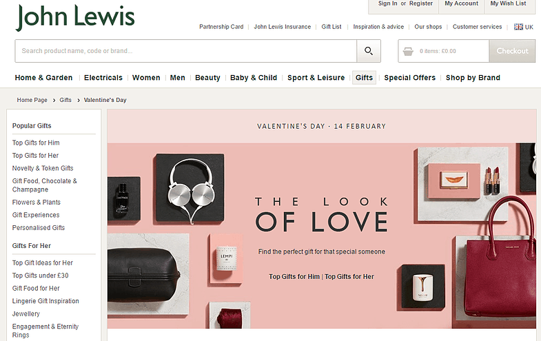
8. Entry for topic collections
Some occasions will be significant enough for site to create topics around them. For example, sites may devote space to promote gift guides and related content.
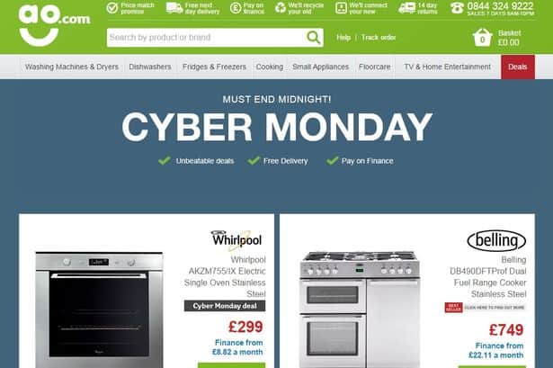
9. Seasonal individual products
This is also a place to show individual seasonal products. This reduces the amount of effort and number of clicks from the homepage to the product page.
For example, sites can show known best sellers or deals straight from the homepage during big ecommerce events like Black Friday and Cyber Monday.
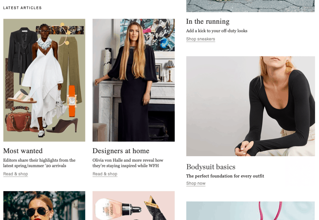
10. Content
Ecommerce sites will prioritise content according to how important they see this for customer acquisition and conversion. It can help to engage customers and to give them ideas and inspiration for purchases.
Net-a-Porter places content at the centre of its homepage, with articles shown more prominently than on many other ecommerce sites.
11. Recommended products
Recommended products can be shown based on preferences at an individual user level, or visitor segments. For example, you could show different products based on a shopper’s previous purchase history.
12. Recently viewed products
If a customer has recently viewed a product it’s a clear declaration of interest, so it can be worthwhile reminding them of the products they viewed when they return to the homepage.
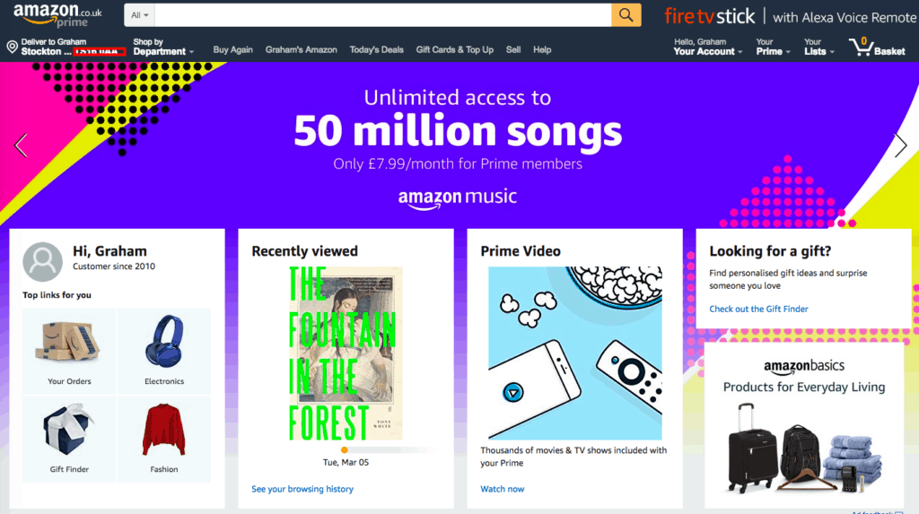
13. Services
Some sites offer finance options, or perhaps membership schemes for delivery and other perks, as Amazon does with Prime.
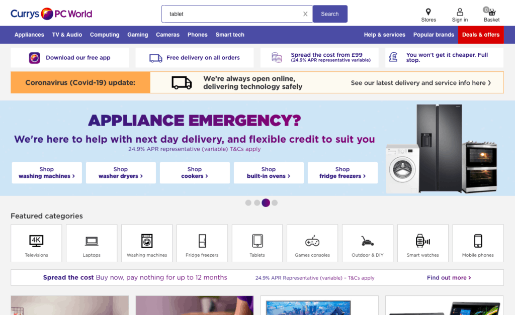
Currys PC World, for example, displays its finance and flexible credit options several times across the homepage – in the offer / USP bar, on the carousel, and just underneath its featured categories.
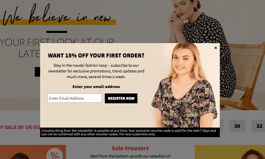
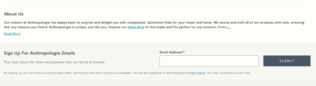
14. Email signup
Most visitors won’t buy straight away, so it makes sense to offer email sign up so they can consent for marketing communications and you can build a list of prospects.
Many sites will place email signups towards the foot of the page, but it can also help to trigger more prominent messages after visitors have been inactive for a period of time.
It’s important to ensure these messages don’t interrupt the customer, so timing and placement is key.
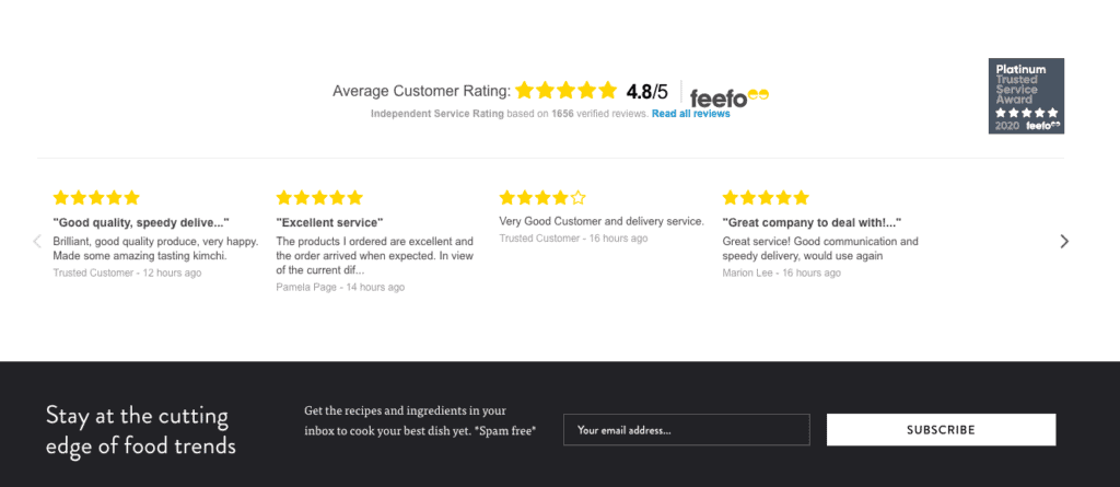
15. Testimonials
Testimonials from existing customers can help to persuade new visitors that a site is trustworthy, and that they’ve been happy with their purchases.
These are different from product reviews, and normally talk about customer service and delivery rather than the products themselves. It can help, especially when customers may be less familiar with the retailer.
16. Ancillary links
These links are for information which customers may head to the homepage for, but are likely to find even if they are further down the page.
This include links to help and FAQs, delivery and returns information, as well as links to related sites, about us pages and more.
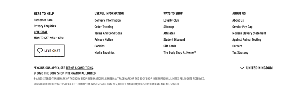
17. Social links
Many sites will show social links in the footer, though some fashion sites will choose to place them higher as they see social playing a key role for them.
18. Terms & Conditions
For those visitors that are looking for them, Ts & Cs are normally to be found in the site footer.
19. Payment icons
Shoeing payment icons, also often in the footer (as on Schuh above) allows customers to see at a glance if their preferred payment method is available.
20. Live chat
Live chat is a useful customer service channel for customers. It can be a more instant option than telephone or email, so it makes sense place a link on the homepage for visitors who arrive looking for it.
21. Contact numbers
Contact numbers and other details like opening hours are displayed in different ways by retailers.
Some will place them in the footer, while others choose to place it in the top header where it’s easier to find.
Secondary homepage features
The following are some of the more niche elements and features that are useful extras for some sites, or perhaps more applicable for some types of retailer than others.
22. Shop the trends
For fashion sites, this may be the latest trends, or perhaps seasonal products related to events like Easter or Christmas.
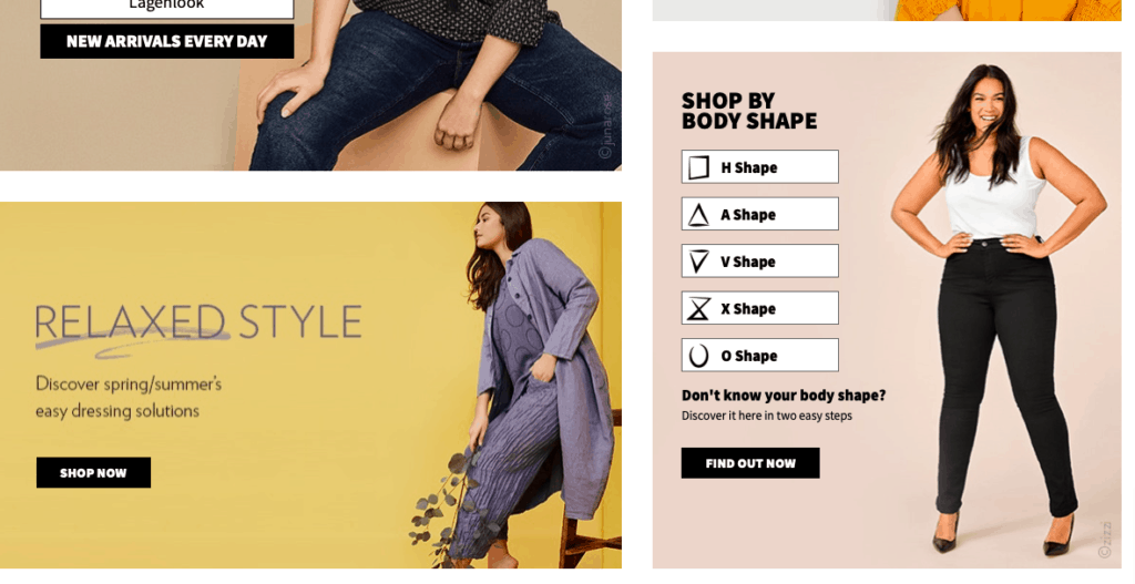
23. Shop by body shape
Allowing customers to shop by body shape on fashion sites, or perhaps to shop by room on homewares sites can speed up the journey for shoppers by helping them to narrow their product selection quickly.
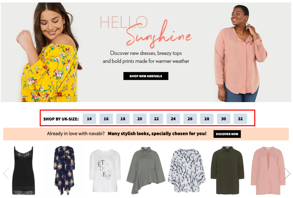
24. Shop by size
This is another option which gets customers into product selection more quickly.
25. Buy again
If customers have bought an item before, showing it when they return is a useful prompt. This can be especially useful for products which shoppers often buy regularly, such as pet food, groceries or consumables like razor blades.
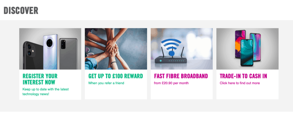
26. Trade in your old X
Trade in options are useful on certain sites, such as console and games retailers, or mobile phone retailers such as Carphone Warehouse.
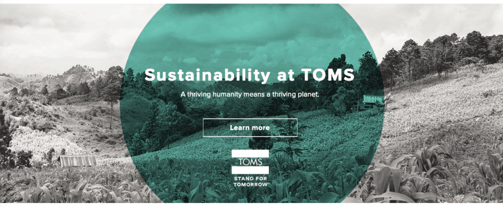
27. Blocks for USPs
Some retailers choose to make their USPs more prominent if they are key to the retailer, using blocks rather than a more easily ignored bar.
A company such as TOMS places ethics at the heart of its business model, and therefore devotes a big portion of its homepage to USPs.
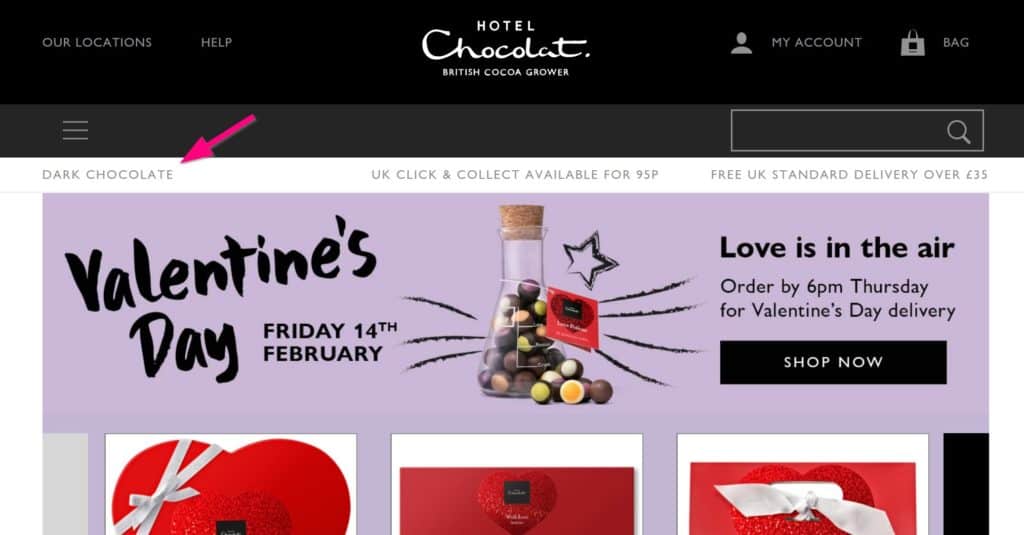
28. SEO text
SEO copy, i.e. text written mainly for the search engines to pick up, has vanished from lots of ecommerce homepages.
This is partly because sites are trying to avoid being seen as ‘over-optimising’ by Google.
When you do see it, it can give you a strong indication of the terms businesses see as the most important.
For example, Hotel Chocolat used to have a prominent and slightly incongruous ‘dark chocolate’ link in the offer bar. When this screenshot was taken the site ranked ninth on Google for this term so was clearly looking to improve this.
29. Security icons
Security icons are there to reassure potential customers that the site is secure and safe to shop from.
This can be more applicable to retailers who may not be familiar to some shoppers, and get help to remove any concerns.
30. Download the app icons
For mobile sites, it’s useful to highlight the shopping app, which can provide a better shopping experience for the user.
31. Store finder
For multichannel retailers, it’s important to cater for ‘offline’ shoppers, and some will be looking for data on store locations, opening hours and contact numbers.
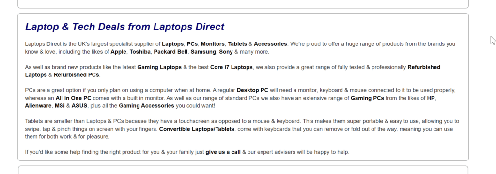
32. Product configurator
Product configurators are a useful starting point for some retailers, where products come with several different add-ons or options, such as laptops.
33. Track your order
Order tracking information is often linked to from order confirmation and shipping notification emails, but it should also be visible on site.

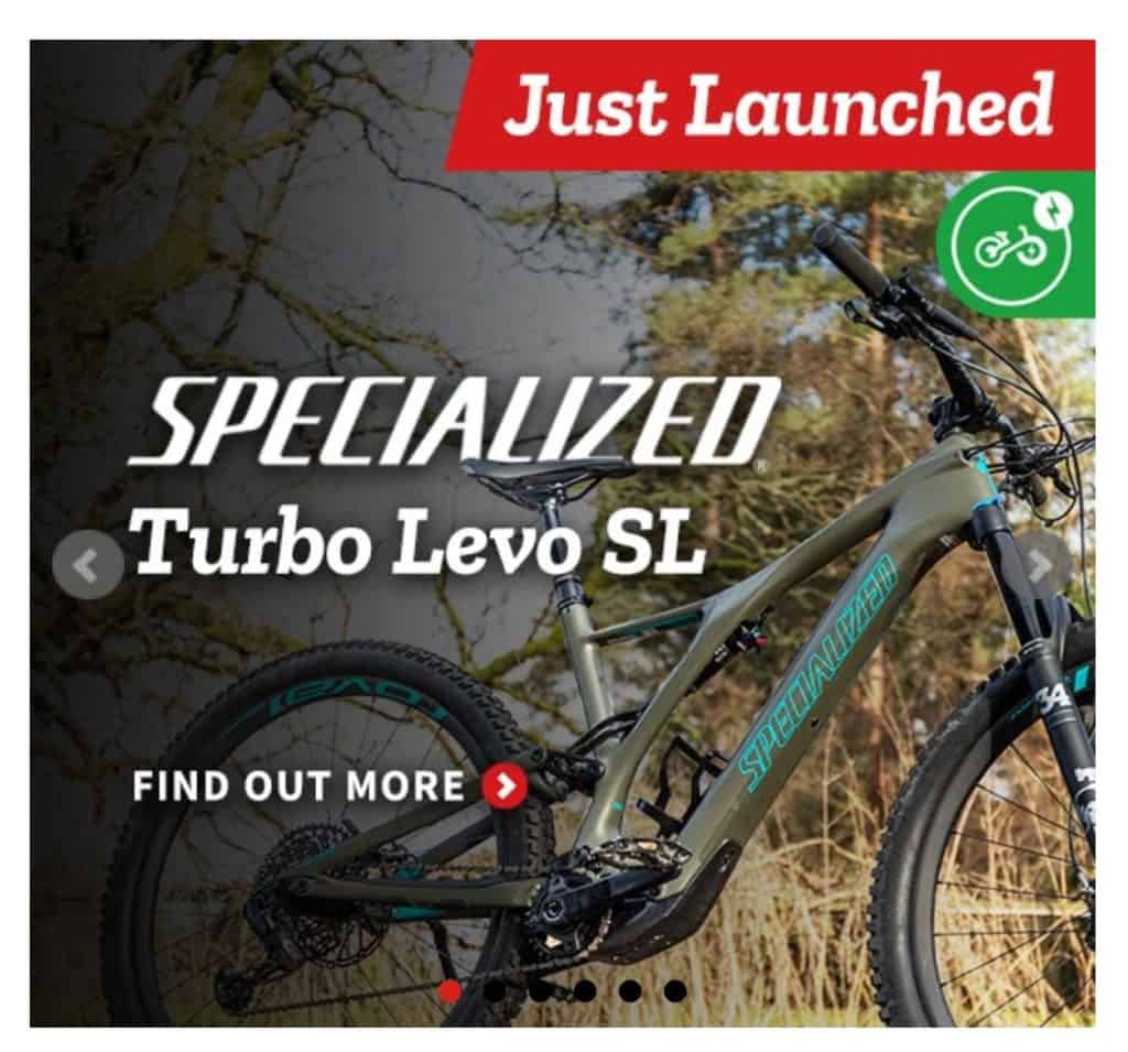
34. Inspiration carousels
Carousels used to be very popular on homepages. They are far less popular now, largely because of a few blog posts.
In some cases they are useful, but are best treated with a ‘show the most important item first’ methodology.
The carousel below from Tredz is a good example. It has left and right icons to navigate and it rotates quite slowly and if you hover over it it remains static so you can read it.
This allows visitors to see the promotions and featured products, rather than just having them pass by without noticing them.
35. B2B login
For sites that sell to both public and trade, a B2B logn options helps to provide a tailored service for each.
36. Push notification opt-in
Push notifications can be seen as intrusive by some users, but for more committed customers, it allows retailers to provide product alerts and marketing more directly.
37. Blog posts, TV ads and other content
Blog links are often an afterthought for some sites, but many (Net-a-Porter and Home Depot to name two) use content well for inspiration and product education.
For retailers who have TV campaigns running, it can pay to reinforce that message for visitors to the homepage, by showing the ad creative and any featured products.
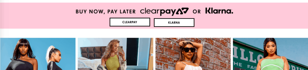
38. Clearpay/Klarna icons.
Pretty Little Thing places its Klarna and Clearpay options prominently on the homepage so shoppers how they can pay in instalments if they prefer.
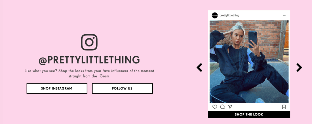
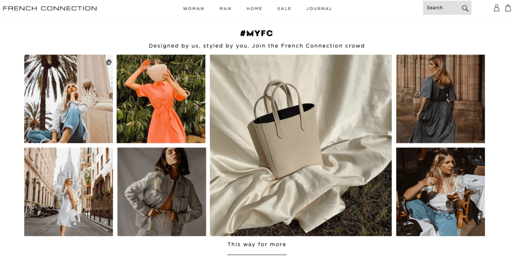
39. Social content
Displaying social media content is a useful form of social proof. It tells the shopper that other people are buying the products and enjoying them, and can act as inspiration for prospective customers.
This content can be pulled in automatically or curated by the retailer, as with French Connection here.
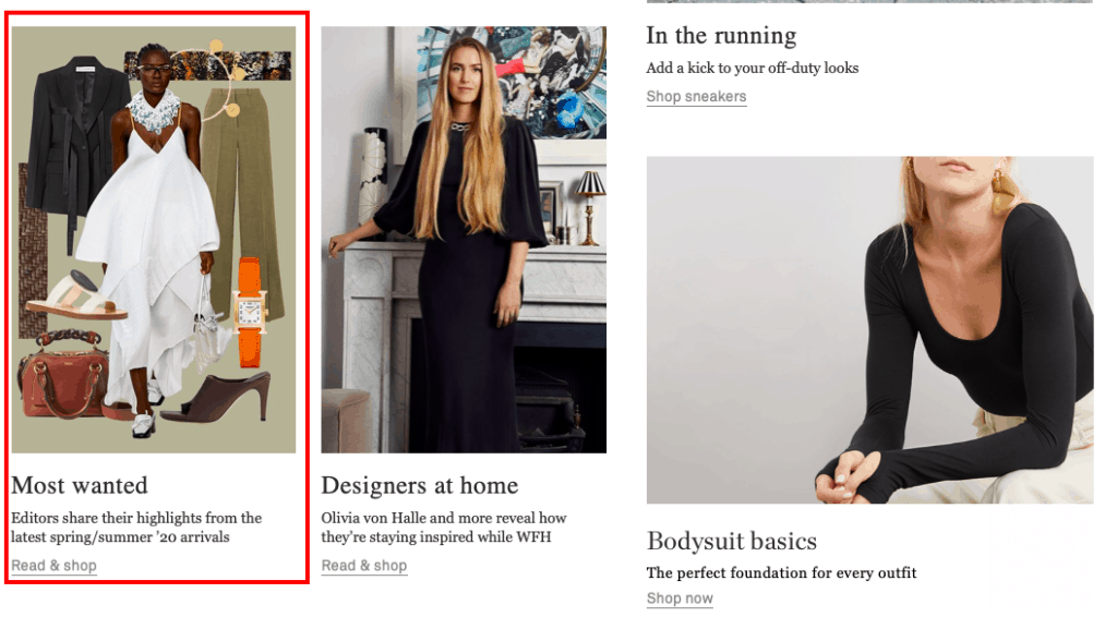
40. Editor’s picks
Here’s a good example from Net-a-Porter, where editors pick out their favourite styles from the season.
41. About the owner
This is an opportunity for a retailer to talk about the brand, perhaps emphasising the history of the brand, the provenance of products or other USPs.
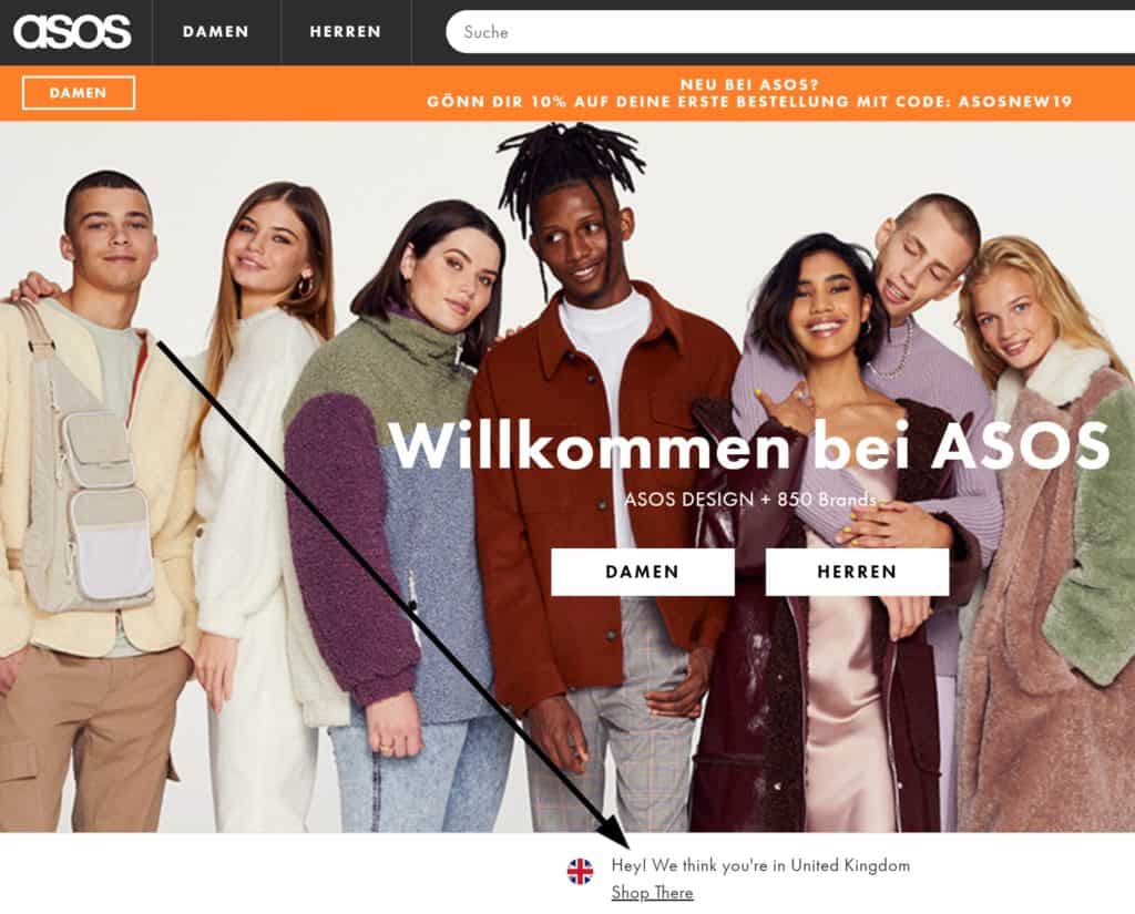
42. Currency and language switcher
If you sell a lot internationally, it’s useful to provide the option for the user to switch language and / or currency.
It can also help to detect the user’s IP address and nudge them in the right direction if you’re serving the wrong content to them.
This is especially important if you serve multiple regions in the same language and if baskets are specific to each region.
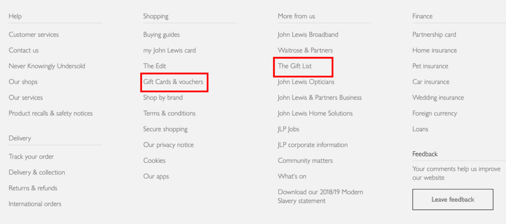
43. Gift services
If you offer gift cards or boxes, or perhaps provide wedding list services, then it’s good to make these accessible via the homepage.
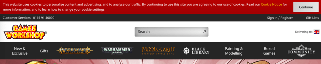
44. The dreaded ‘cookie’ block
Since enforcement of GDPR and even before, sites have been handling cookie notifications in different ways.
Many ecommerce homages now contain cookie notification bars at the top or bottom of pages do that users can accept or review how their cookie data is used.